01
Section 01
Brand Story
Who we are, why we exist, and the beliefs that hold up everything we build.
The complete standard for how Real Steel Canopies looks, sounds, and shows up — across every job, sign, truck, and screen. Built to last, on brand, every time.
This document defines the visual and verbal identity of Real Steel Canopies. Follow it when you build a sign, wrap a truck, print a proposal, post online, or brief a vendor. When something isn't covered here, protect the spirit of the brand — rugged, engineered, dependable — and ask before you improvise.
Who we are, why we exist, and the beliefs that hold up everything we build.
Real Steel Canopies was born out of a simple mission: to help businesses safeguard their assets and ensure peace of mind. We saw too many companies suffering from weather-related damages, losses that could be prevented with the right protection.
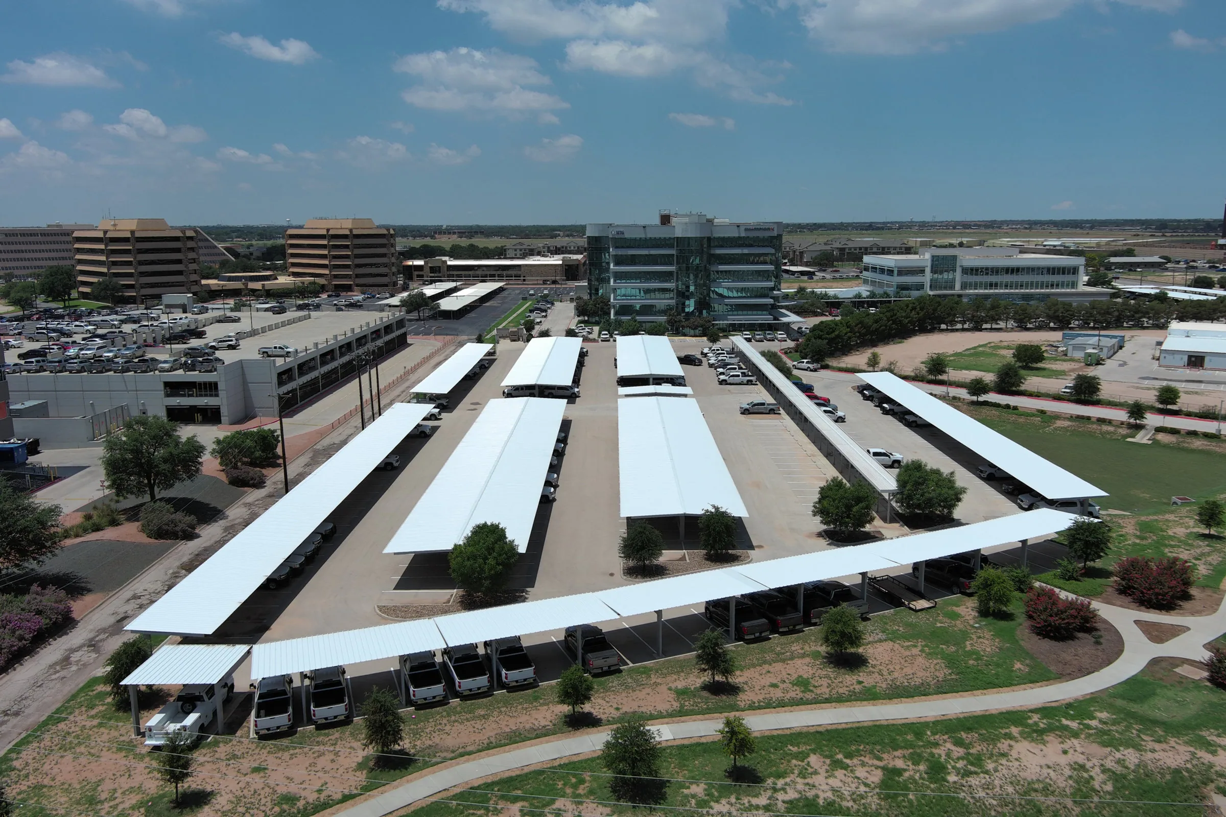
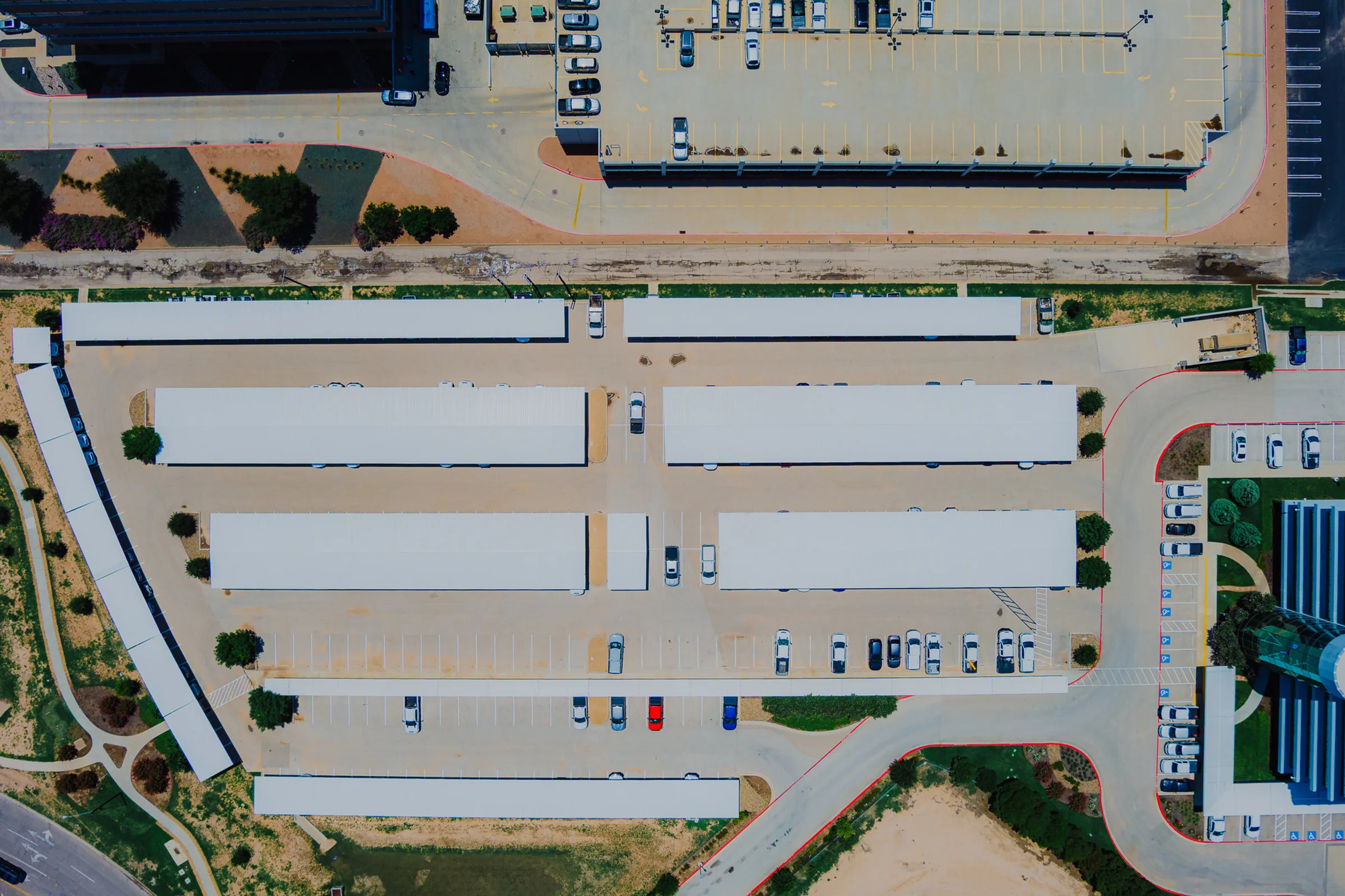
So we built a company that controls the outcome. From our Lubbock, Texas headquarters, we design, engineer, and fabricate commercial steel canopies in-house, then install them nationwide. Every project — from large-scale commercial developments to custom bespoke structures — is a testament to strength, simplicity, and well-executed design.
Twenty years on, the mission hasn't changed. We still believe every client is a long-term partnership, and that the best structure is the one you never have to think about again.
Safeguard our clients' assets and deliver lasting peace of mind — with steel protection built to outlast the weather.
To be the most trusted name in commercial steel canopies nationwide — the benchmark for structures built to last.
Own the whole process — design, engineering, fabrication, install — so quality is never left to chance.
We engineer past the minimum. Every structure is meant to shrug off sun, hail, and storms for decades with minimal maintenance.
Design, engineering, fabrication, and installation happen under our roof. When we own the process, we own the result.
To code, to wind load, to spec. OSHA 30-certified leadership on every job means safety and precision are non-negotiable.
Clear scopes, honest timelines, no runaround. We say what we'll do, then do it — and we pick up the phone.
Every client is a relationship, not a transaction. We build for the second project, and the tenth.
The space we own in the market, who we build for, and why they choose us.
For the developers, contractors, and public agencies who can't afford to let weather win, Real Steel Canopies is the nationwide steel-canopy specialist that designs, engineers, fabricates, and installs every structure in-house — so quality, code compliance, and timeline stay in one accountable set of hands.
We don't dabble in canopies. It's the whole company — and that focus is the difference our clients feel on every job.
Want durable, attractive covered parking and entries that raise property value, tenant retention, and curb appeal.
Need a specialty sub that hits spec, code, and schedule — fast, clean installs, zero babysitting.
Require code-compliant, documented, safety-certified structures for high-traffic public spaces and fleets.
Add covered parking that drives resident satisfaction, retention, and a premium, cared-for look.
Multi-site brands needing engineered drive-thrus, branded entries, and fleet cover built to a consistent standard.
How Real Steel sounds — the personality, the principles, and the exact words that carry the brand.
Steel, grit, built to last. Plain-spoken and unpretentious — the voice of people who work with their hands.
Precise and spec-driven. We lead with proof — numbers, loads, codes — never empty hype.
Accountable and steady. Texan straight-talk you can plan around — we say it, then do it.
Short sentences. Plain words. Cut the corporate fog and the filler.
Lead with specifics — 20+ years, wind loads, OSHA 30 — not adjectives.
Frame the work around safeguarding assets and delivering peace of mind.
Talk like a builder who takes pride, not a salesperson closing a deal.
Rules: Never rewrite the primary tagline. On the website it is set as its own red eyebrow line above the hero headline — it is NOT baked into the web logo file (logo-mark.svg carries no tagline); the full print lockup with the tagline arc is print/signage-only. Use one tagline per touchpoint; never stack them. Support lines rotate in marketing but never replace the descriptor in formal or legal contexts.
Real Steel Canopies designs, fabricates, and installs commercial steel canopies, covered parking, and shade structures nationwide. Based in Lubbock, TX. (This is also the site's canonical SEO description.)
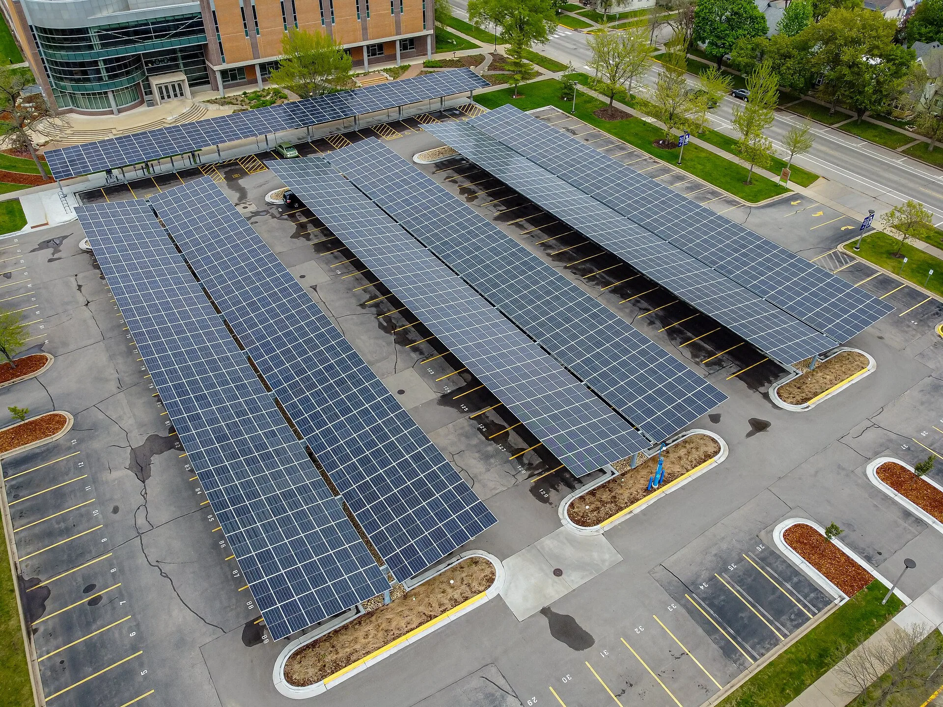
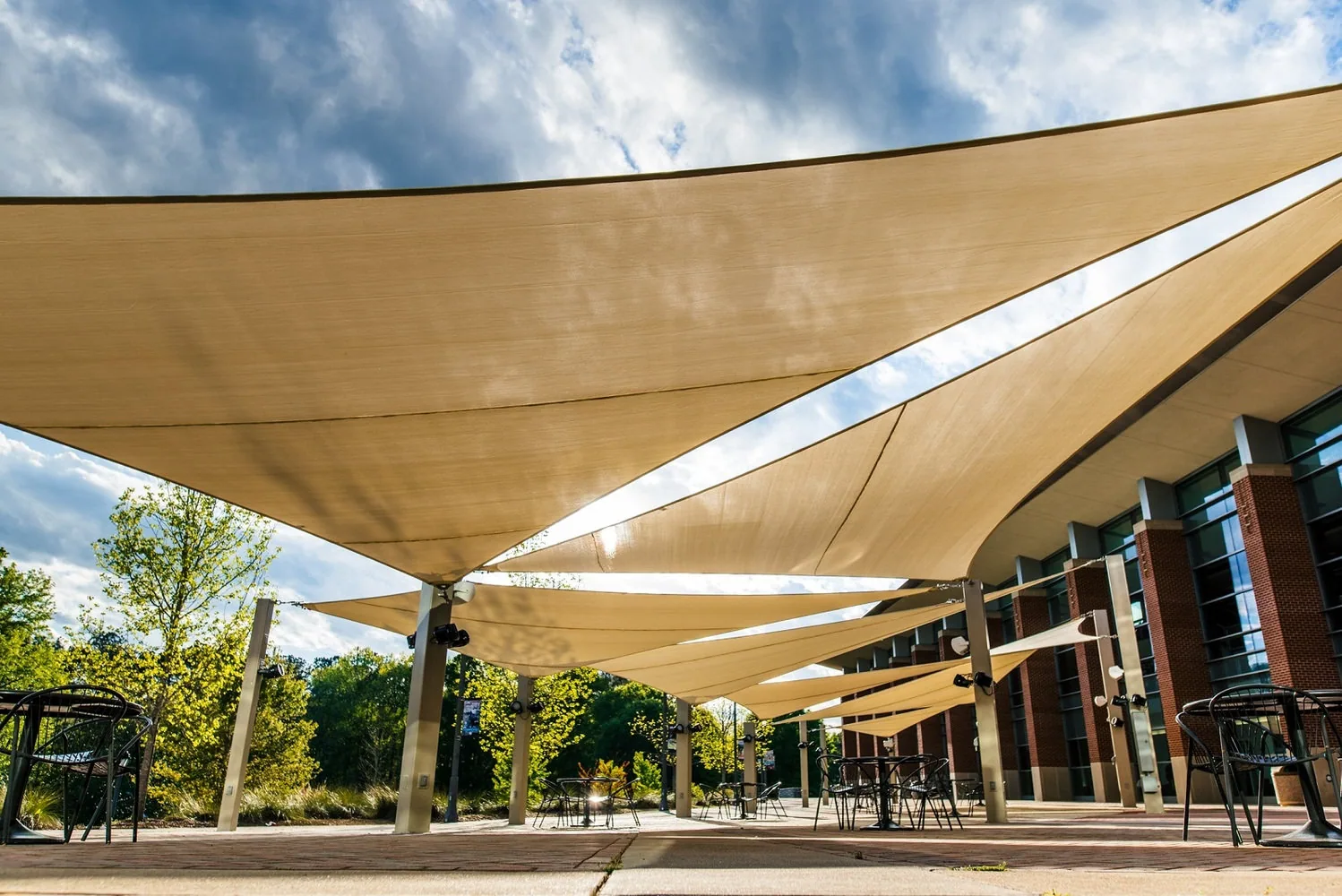
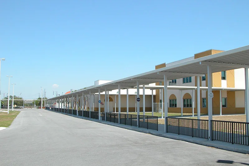
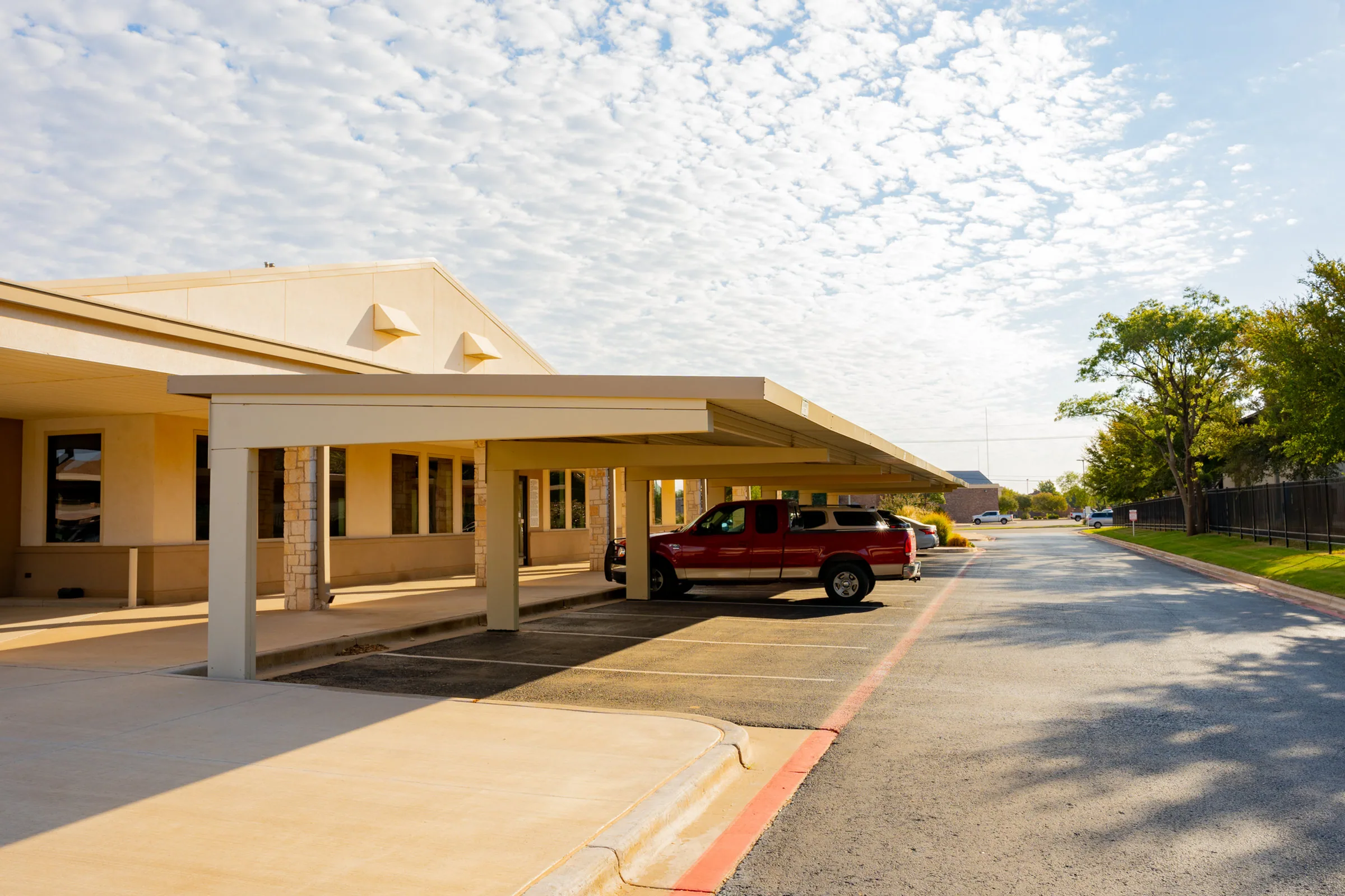
Real Steel Canopies is a commercial steel-canopy specialist headquartered in Lubbock, Texas, building nationwide. For over 20 years we've designed, engineered, and fabricated canopies, covered parking, solar, and shade structures in-house — then installed them with OSHA 30-certified crews. Every structure is engineered to code and built to protect what matters, season after season. We believe each client is a long-term partnership.
"We design, build, and install steel canopies that outlast the weather."
"Engineered to local wind loads and finished galvanized to resist corrosion for decades."
"World-class, best-in-class canopy solutions leveraging synergy."
"Our canopies are super strong and last forever."
The single most recognizable asset we own. Use it correctly, consistently, and give it room to breathe.
The full lockup — tagline arc, canopy device, wordmark, and descriptor bar — is the default. Lead with it wherever space and legibility allow. Never rebuild, retype, or rearrange it; always place the approved artwork file.
For tight spaces — avatars, favicons, app tiles, stamps, and hard-hat decals — use the standalone canopy mark derived from the logo's single-slope device. Never stretch the full lockup to fill a square; use the mark instead.
Keep clear space equal to X — the cap height of "REAL STEEL" — on all four sides. Nothing (type, imagery, edges, other logos) enters this zone. More space is always better.
Below these sizes, legibility of the tagline and descriptor breaks down — switch to the canopy mark.
Steel and signal red. A disciplined, high-contrast palette built for the field and the screen. Tap any swatch to copy its hex.
The brand's ink. Type, dark surfaces, and structural weight. Our default over pure black (#000). Warm by design: every Real Steel neutral keeps R ≥ G ≥ B, so nothing ever reads blue. Deep zones (hero, footer, dark bands) step down to Iron #0c0a09.
The signature accent — signal red, hot steel, Texas grit. Use sparingly for emphasis; set type on it in white only.
Warm Steel supports UI, dividers, and secondary text. Blueprint Blue is PRINT-ONLY: reserved for engineering drawings, callouts, and spec sheets. It never appears in web UI — the site palette carries no blue at all (warm-neutral rule), and on-screen technical linework is drawn in black at 4% opacity on a 56px grid.
On Real Steel Red, set text in white. Red-on-black and black-on-red pairings are display-only — 24px+ bold.
Safety Yellow (#F4C300) and hi-vis orange appear on PPE, hazard markings, and jobsite signage for regulatory reasons — they are functional, not brand colors, and should never migrate into marketing layouts. Digital status colors (success green, error red) live in the Digital section.
A two-part system on the web — condensed uppercase display and a clear interface sans. A technical mono joins for print spec sheets only.
An engineered condensed grotesque. Always set UPPERCASE with tight tracking and 0.9–0.95 leading — it carries the brand's structural confidence in every headline, nav item, and button.
Highly legible at any size. The workhorse for paragraphs, UI, proposals, and forms.
PRINT ONLY: spec sheets, dimension callouts, and engineering documents. Never used on the website — web labels and eyebrows are set in Inter.
Every structure is designed, engineered, and fabricated in-house — built to exceed industry standards and perform for decades.
A geometric icon set and a small kit of graphic devices that make any layout unmistakably Real Steel.
Line icons drawn on a 24px grid with a consistent 2px stroke, round joins, and no fills. Single-color — Structural Black or Real Steel Red. Functional and blueprint-like, never decorative or cartoonish.
Technical backdrop for dark sections, covers & dividers. On light web surfaces it renders as 1px black lines at 4% opacity on a 56px grid — never blue.
Two shipped forms: a 1×28px red hairline preceding every eyebrow label, and a 4px full-width red seam topping dark bands.
Frame photos & callouts with a drafting-mark feel.
Two kinds: the RED diagonal stripe (12px on / 12px off, brand red on dark) is an approved marketing accent — the site ships it as a section motif. Yellow/black hazard marking stays jobsite-functional only.
Oversized Barlow Condensed numbers as watermark structure.
The canopy silhouette as a divider & accent motif.
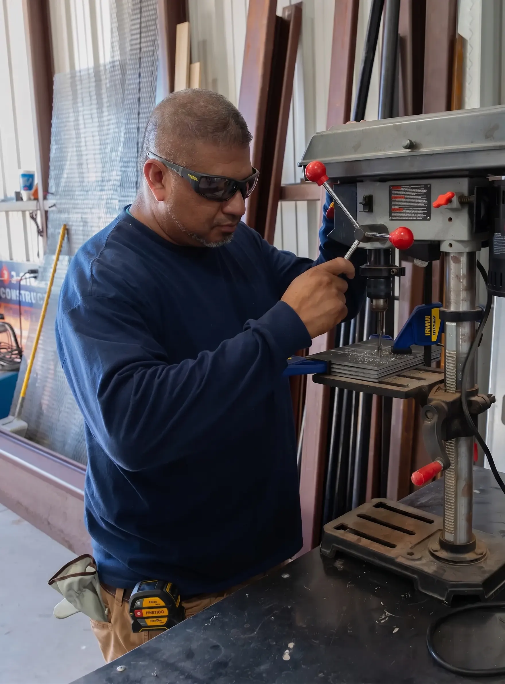
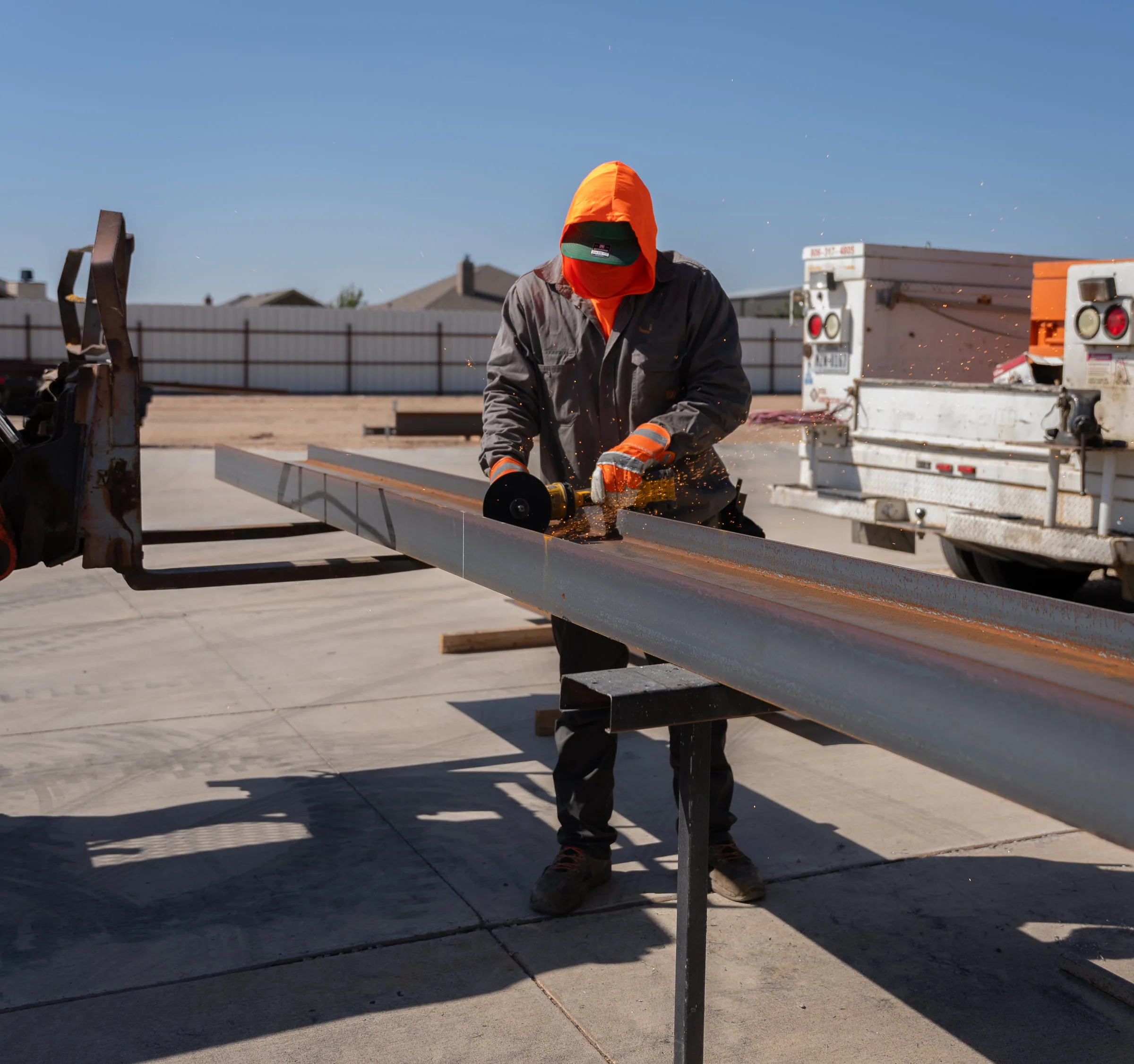
Real steel, real sites, real crews. Our photography is our proof — it should always look like the work, never like stock.
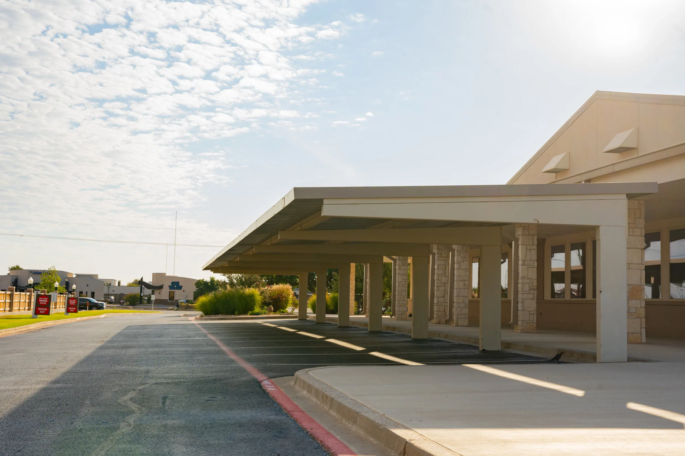
Actual Real Steel projects on real sites. Never generic stock or rendered fakes.
Shoot in daylight — bright, clean skies or golden hour. Honest exposure, no heavy filters.
Include vehicles, people, or crews to convey the true size and strength of a span.
Use beams, columns, and roof edges as leading lines. Strong geometry, low angles.
Welds, bolted connections, and finishes prove craftsmanship. Get close.
Cool, neutral tones with strong contrast. Never oversaturated, warm-yellow, or HDR.
Clean daylight, strong structural geometry, generous sky. Looks like our work — because it is.
Oversaturated, warm, heavy-filtered grades. It reads as fake and undersells the steel.
One photo per project, straight from the project albums. Drag a different frame onto any tile to swap it — drops save automatically and travel with this guide.
Site client roster (source of truth — lib/site.ts): Bank of America · Texas Mutual · Seal's Commercial Concrete (sister company — sealscommercialconcrete.com) · APA Corporation · Austin Industries (austin-ind.com) · City of Lubbock · Adolfson & Peterson · Lee Lewis Construction · Saginaw Police · Rent LBK · Collier Construction · Kairoi Residential · Lifted Trucks · Raiders Pass. Albums above without a roster entry (50th Street, HCHT CPA, The Shop, Mail Box Coverings, Standard Sales, U Club) are project-photo archives, not marquee clients.
Structure on the page mirrors structure in the field — a disciplined grid, a 4-point rhythm, and room to breathe.
Twelve columns divide cleanly into halves, thirds, and quarters. On the web, containers cap at 1280px (max-w-7xl) with 20px page padding on mobile and 32px from the sm breakpoint up; print margins are 0.5–0.75in. Content is left-aligned and capped at a comfortable measure — never full-bleed text.
Every margin, pad, and gap is a multiple of 4. This keeps spacing consistent across web, print, and signage regardless of who's building.
The brand where it lives — on trucks, hard hats, signs, proposals, and feeds. These are direction, not final artwork.
The brand on screen — interface components, links, status colors, and the details that carry across email and app icons.
2px corner radius, no gradients, no dark solid variant. Four shipped variants: primary (red, shadow + lift on hover), outline, outline-light (white/30 border — used for "View Our Work" on dark), and ghost. All buttons set in Barlow Condensed UPPERCASE with a trailing arrow; on red, text is white only.
Body copy with an inline link styled in Real Steel Red with a 3px underline offset.
Forward guidance for dashboards and system UI. Note the shipped reality: the live contact form signals errors in the accent family (#c2151c text, red required markers), which is acceptable on marketing pages — adopt #C0432A wherever a true status system exists so errors stay distinct from brand red.
The one-page gut check. When in doubt, come back here before anything ships.
Consistency is what makes a brand feel dependable. Before anything goes out — a sign, a bid, a post — check it against this guide. When something isn't covered, protect the spirit: rugged, engineered, dependable. Ask before you improvise.